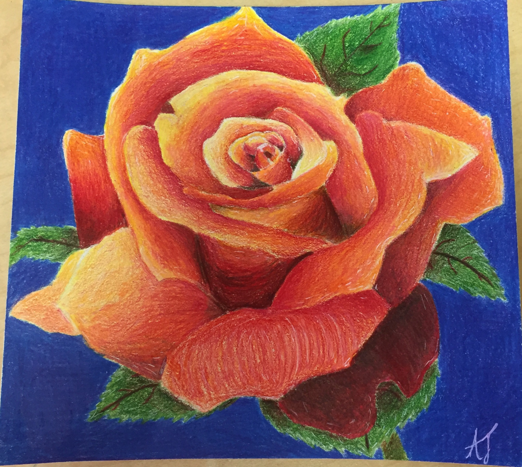
I created texture in this project by the strokes I used along the rose and leaves. I scribbled on the leaves with my base color and then went back over with some shadows to create some dimension to them. By using a white gel pen I added highlights and made the edges to them look more rugged. On the Rose, I changed up my line direction to make colors flow easier between each other and not make the lines look streaky. Also, on the bottom petal that folds down I used directional lines in multiple colors and multiple layers to add a realistic effect that the Rose folds over.
This was the first time I really used prismas to color and draw. I really appreciated how my project turned out. Throughout the project I slightly struggled with blending the colors properly, while also making sure the lines I created weren't streaky looking. I learned that many of the tools used when drawing with pen/pencil are applicable to prisma colors, which makes sense. Overall, I am extremely pleased with how I was able to make my project turn out and how I made it look realistic.
This was the first time I really used prismas to color and draw. I really appreciated how my project turned out. Throughout the project I slightly struggled with blending the colors properly, while also making sure the lines I created weren't streaky looking. I learned that many of the tools used when drawing with pen/pencil are applicable to prisma colors, which makes sense. Overall, I am extremely pleased with how I was able to make my project turn out and how I made it look realistic.
